Toggle
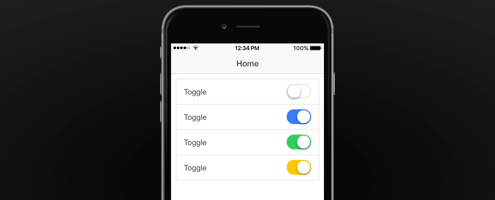
The Toggle Component is an on/off switch that can be used for a true/false variable in your app.

Attaching Data to Form Components
When making your app function, most of the time you will be using
ng-modelto attach some data to a form related component. Check out our ng-model documentation or Working with Form Data tutorial to learn more.
Toggle Properties

Text
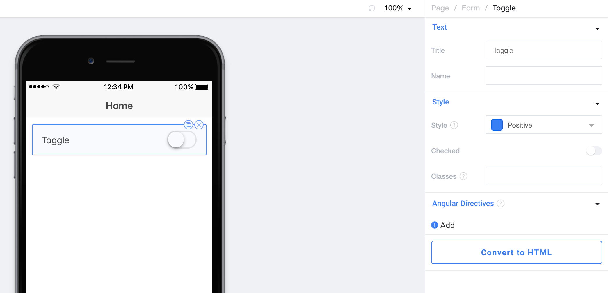
Title controls the text that appears to the left of the toggle.
Name controls the HTML name attribute for the input.
Style
Style sets the Theme Color that will be used to style the toggle when it is on.
Checked sets the default checked state of the Toggle. It is recommended that you do not use this with ng-model.
Classes lets you freeform add CSS classes that will be placed on this component.
Angular Directives
Angular Directives lets you add Directives to the component.
Convert to HTML
Convert to HTML let's you turn this component into an HTML component so you can edit it to your hearts content.
Working with Form Data
If you're looking to attach an input to data here are some tutorials that will help lead you in the right direction:
Working with Form Data
Using APIs with $http Part 1
Directives (with an emphasis on ng-model)
Updated less than a minute ago
