Lists
Lists encompass a lot of functionality in Creator. There are seven built in Components that can help you on your list building adventures. 🕵
Here you'll find information on how to use them, as well as detailed instructions and video on how to use some of the more advanced List features!
Creator's List Item's come in a variety of types each with their own look and feel. The four main types are:
You can change List Item Type on the fly!
All four list item types are actually one component, we just give you 4 different draggable icons for 4 different default settings. So if you need to change between a Thumbnail List Item and Avatar List Item, just change the type in the Properties panel.
There are also two other Components that help out when building Lists:
Regular List Items

A regular List Item is a simple component that has one line of text that you can change. This type can also have a note on the right hand side.
Thumbnail List Items

A Thumbnail List Item has a large square image on the left, a normal heading, and a second (word wrap-able) line for additional information to be displayed.
Icon List Items

An Icon List Item has any one of our Ionicons on the left hand side with one line of standard text. This type can also have a note on the right hand side.
Avatar List Items

An Avatar List Item has a circular image on the left hand side, one standard line of text, and an additional (word wrap-able) second line of text.
Right Side Icons & Notes
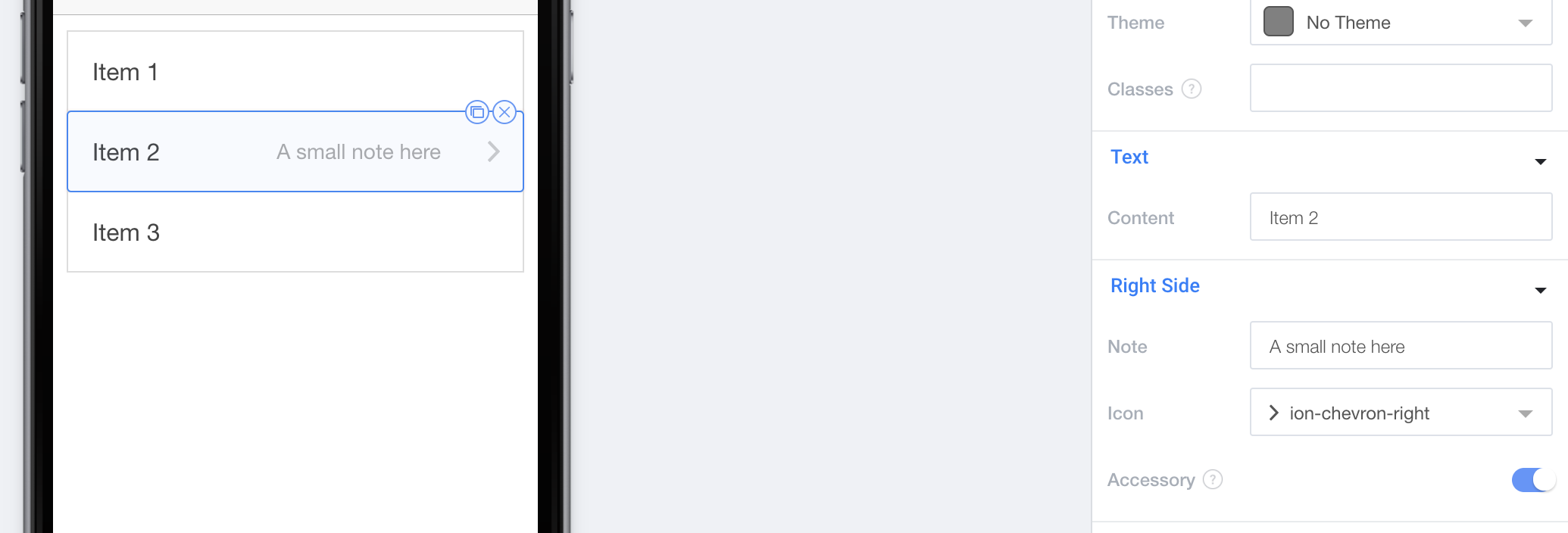
Every List Item type can also have an Icon on the right hand side. This Icon can be selected from any of our Ionicons.

You can also toggle whether or not the Icon is an "Accessory". Accessories will be made smaller and gray. This is extremely useful for icons like ion-chevron-right which can be used to visually denote the ability to click a list item:

Regular and Icon List Items also both have the option to have a Note on the right hand side. This Note is a smaller gray section of text on the right hand side of the List Item.

List Dividers
List Dividers allow you to section of List Items with a Header like divider. Just give it a title and you're ready to go!

Making Lists Full Width
If you'd like to make your List extend to the edge of both sides of the phone, you actually have to set the List to full-width on the actual List component, which you can select in the sidebar.

Delete, Reorder, & Swipe Buttons

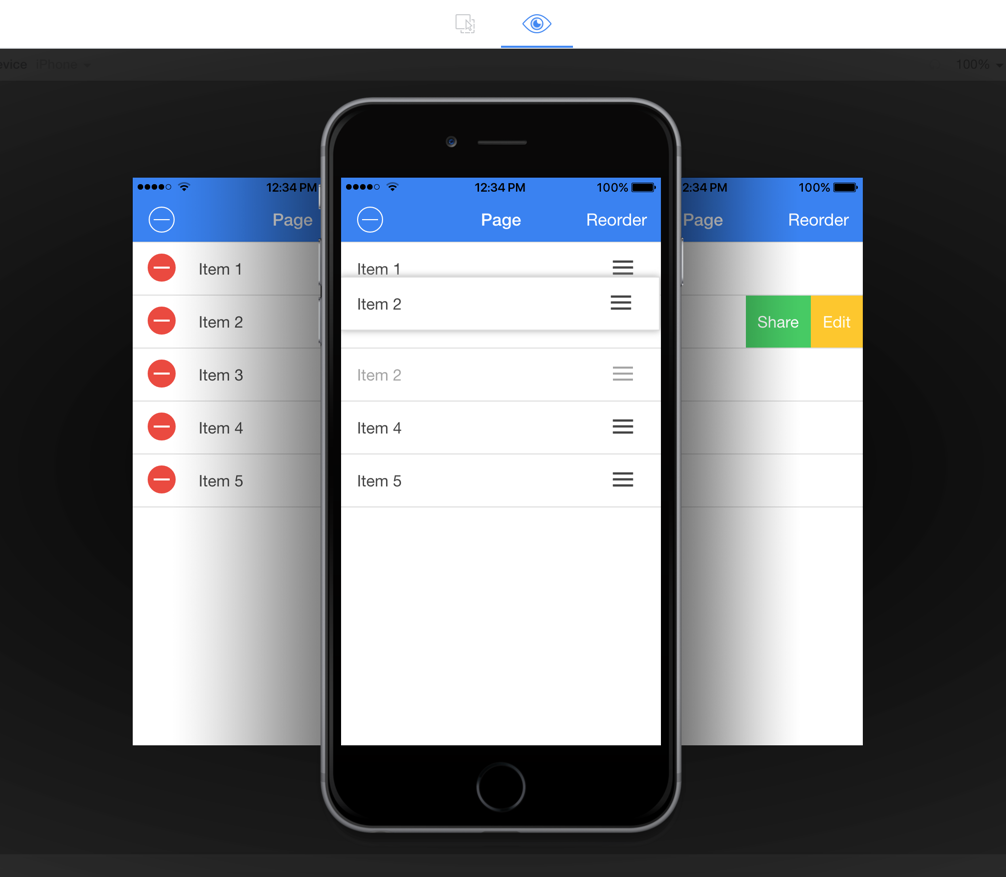
Creator allows you to use many different interactive button types with List Items. Click here to learn more about how to use them.
Updated almost 8 years ago
