Buttons & Button Bars
Buttons and Button Bars are some of the most commonly used Components in Creator. Let's dive in and learn how to use them!
Button Properties

Link
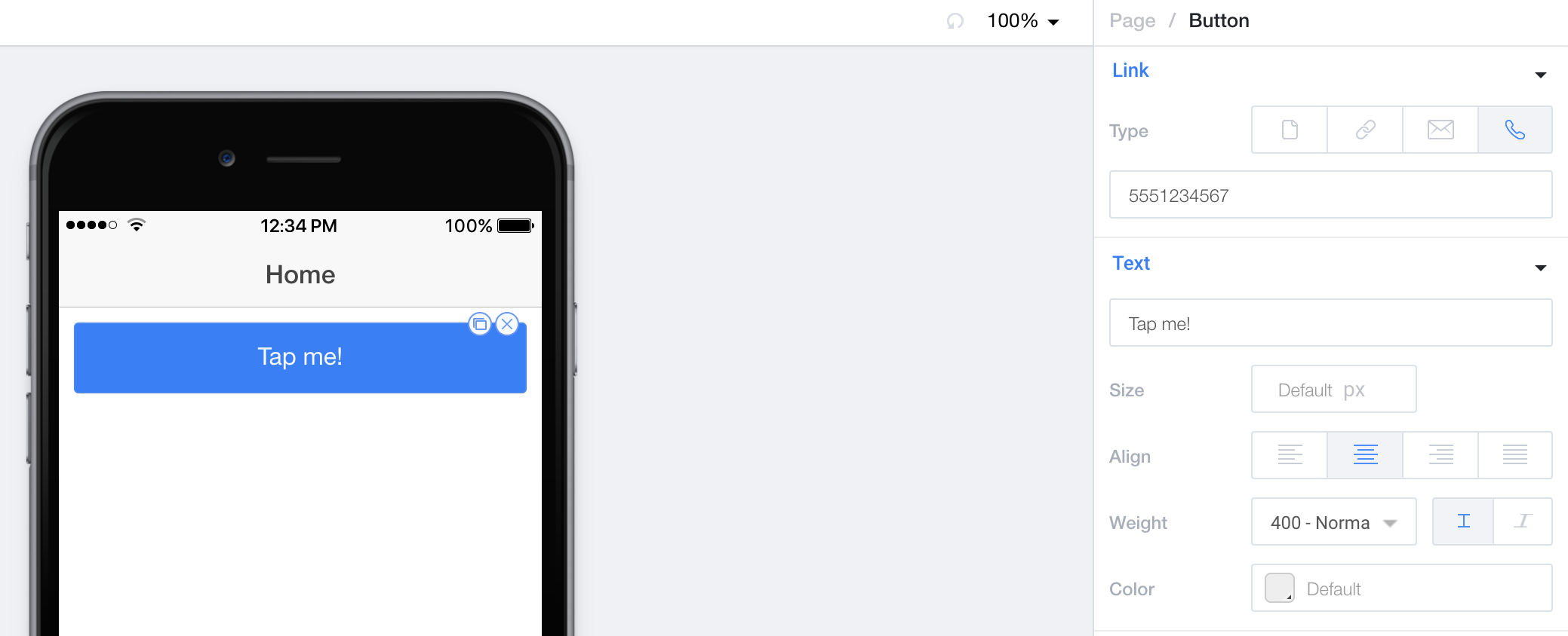
Link allows you to navigate to a different page or add a special link to this button. Please see our Navigation & Special Links documentation for more information.
Text
Text allows you to specify the textual content of the button. (Feel free to use Templating Syntax)
Size allows you to set the font size in pixels for the button text.
Align lets you choose from a standard left, center, right, or justify text alignment.
Weight determines the font weight of the text, as well as whether or not the text is italic.
Color is a color picker that lets you choose the color for the text.

Style
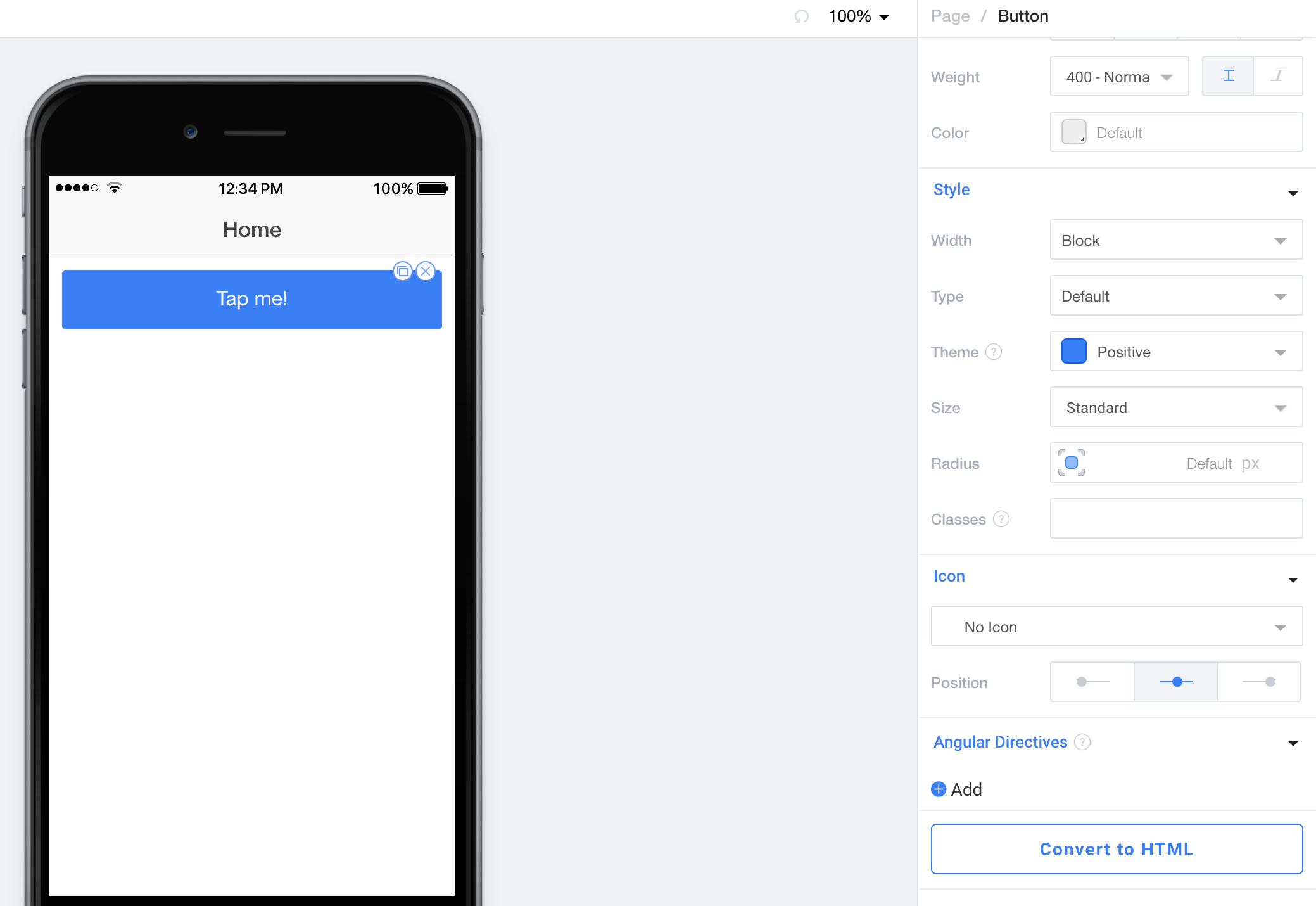
Width allows you to set whether or not the button is inline (only the width of the text), block (the width of it's container), or full-width (extending beyond the container to the width of the page).
Type allows you to set the visual type for this button. Pictures of each option are in the dropdown for the setting.
Theme allows you to choose the color scheme for the button. See Theming & SCSS for information on working with these Theme colors.
Size determines whether or not the button is small, medium, or large.
Radius allows you to set the overall corner radius for the button, or individually set each of the four corners.
Classes lets you freeform add CSS classes that will be placed on this component.
Icon
Icon allows you to choose an icon to put on the button. "No Icon" is the option you should choose if you'd like to remove the icon.
Position allows you to choose if the icon is aligned left, right, or center compared to the text.
Angular Directives
Angular Directives lets you add Directives to the component.
Convert to HTML
Convert to HTML let's you turn this component into an HTML component so you can edit it to your hearts content.
Button Bars

When you drag over a Button Bar, you'll see that we pre-populate it with three different buttons for you. These buttons can be deleted, and additional buttons can be dragged in if you like. Each button works with it's own properties from above.
Learn how to toggle content with a button bar
Check out our Toggling Content Weekly Workshop to learn how to use a button bar to toggle between different sets of content.
Style
Classes lets you freeform add CSS classes that will be placed on this component.
Angular Directives
Angular Directives lets you add Directives to the component.
Convert to HTML
Convert to HTML let's you turn this component into an HTML component so you can edit it to your hearts content.
Updated less than a minute ago
