Theming & SCSS
Our Theming & SCSS feature allows you to customize the look and feel of your app. The Theming feature is accessed either through the brush icon in the top right of your screen, or the button in the Code Bar.
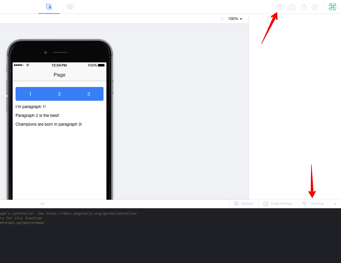
Remember to save your changes!
The Theming & SCSS settings all recompile your settings and then reload them in the editor and preview. Because of how this works, it's important that you save your changes for them to actually take effect!
Quick Walkthrough Video
Watch Brody make some quick changes using Theming & SCSS.
Page and Header Themes
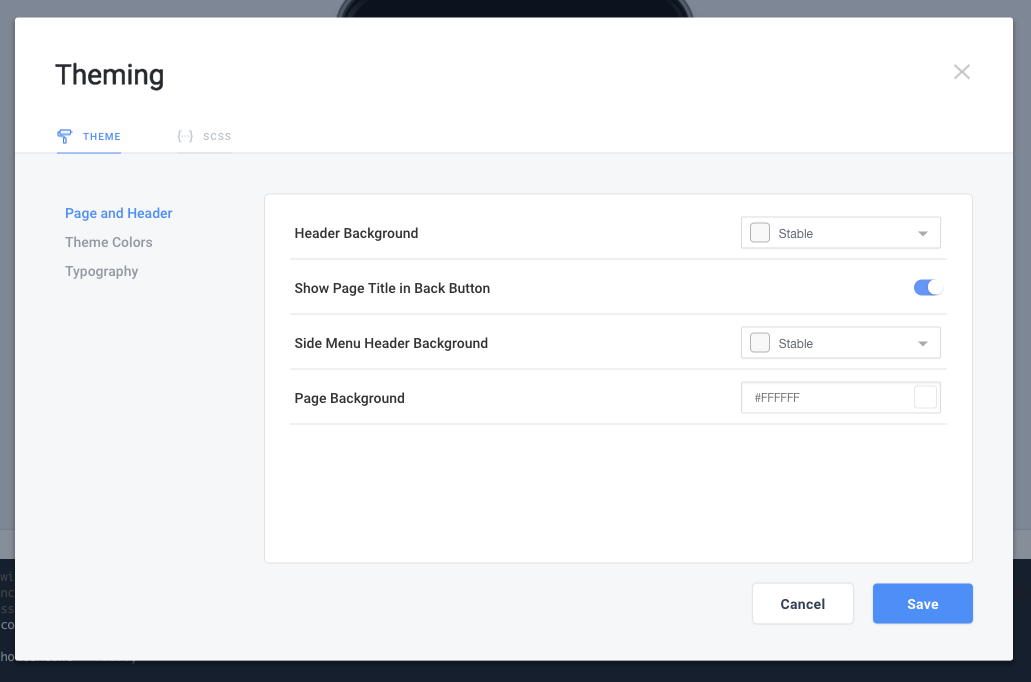
When opening the Theme window, you'll first be at Page and Header settings. Here you'll find several settings that will affect the entirety of your app.
Header Background will change the color of the header bar for all of your pages. It's based on a Theme Color (more on that in a minute).
Show Page Title in Back Button when on (default) will show "< Title" in the header where Title is the name previous page. If you toggle this to off it will show just "<" in the header.
Side Menu Header Background functions the same as Header Background but only affects Side Menu headers.
Page Background sets the default background color of all of your pages. This will open a color picker.
Theme Colors
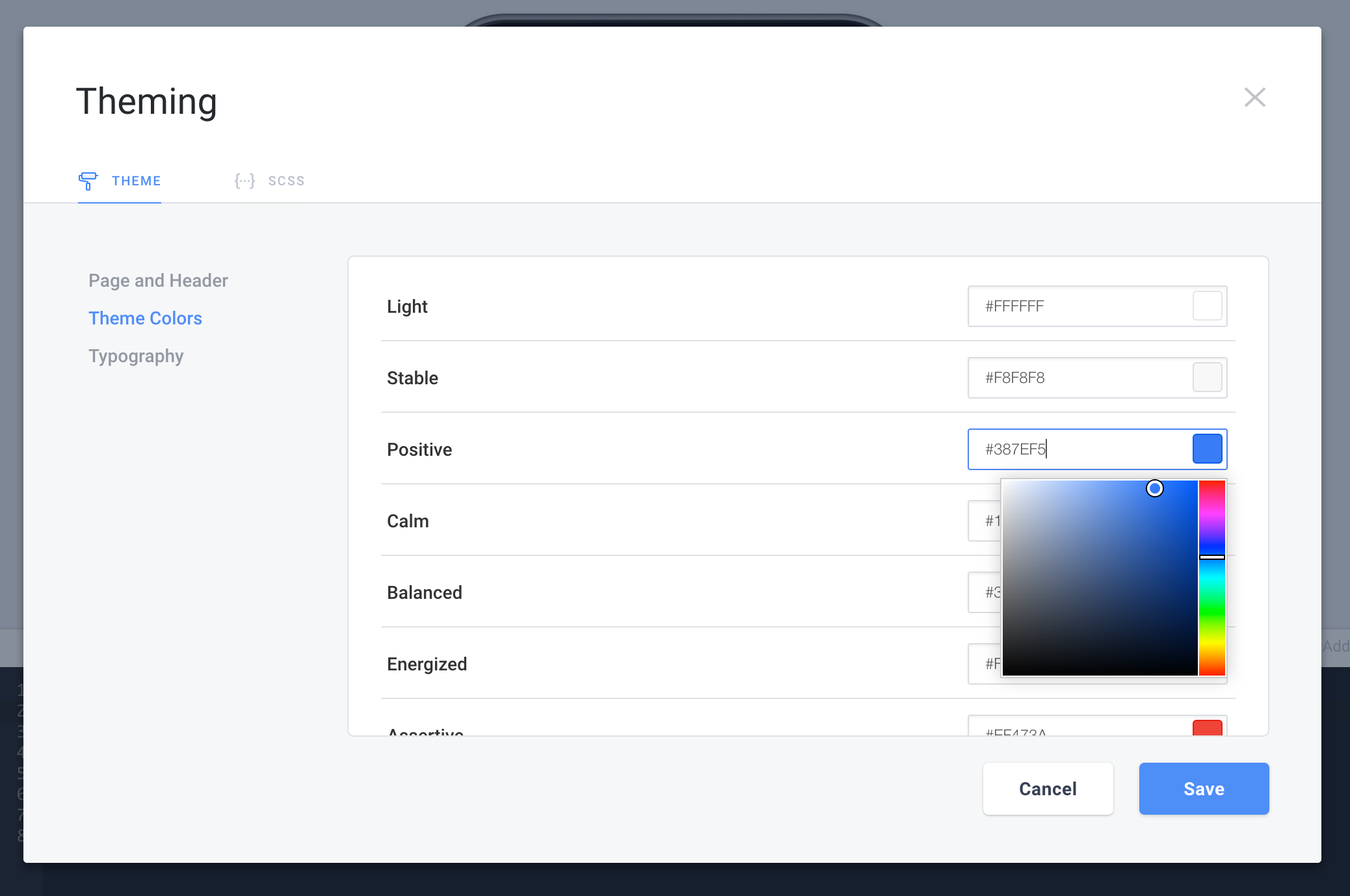
You'll see references to Theme Color all over Creator. We already saw them in the Header Colors above, but you'll also find them on Buttons, List Items, and more.
Theme Colors are an Ionic concept that allows one color to propagate through your entire app. You'll start with the default Ionic settings for each of the 9 Theme colors.
You can set each Theme Color by pasting in a HEX code or using the Color Picker. This will affect anything in your app that uses that Theme Color.
Typography
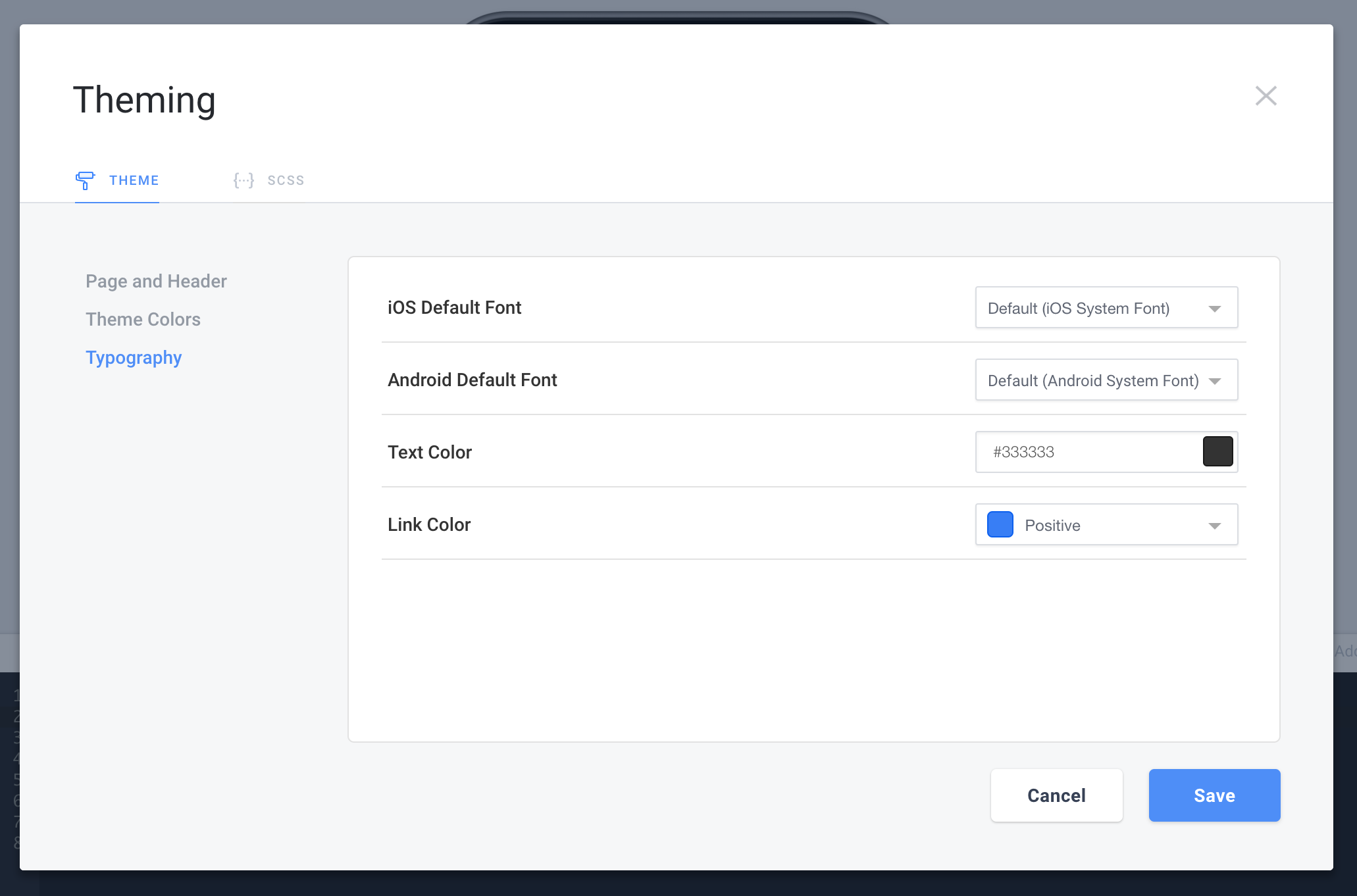
The Typography settings control the font and font colors throughout your app.
iOS Default Font will be controlled by the operating system unless you specify one of the several Google Fonts that we've made available in Creator. (Check out Brody's video above if you'd like to use a different Google Font we don't include)
Android Default Font will be controlled by the operating system as well unless you specify a different font.
Text Color is a color picker that allows you to change the default text color for your entire app.
Link Color allows you to pick a Theme Color that will be used to style all <a> links in your app.
Custom SCSS
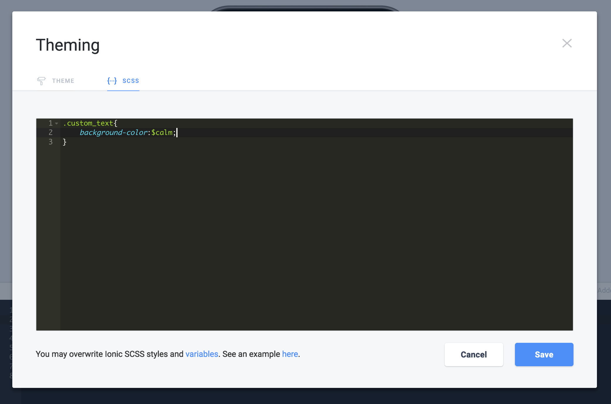
The SCSS Tab is a blank slate that allows you to use any SCSS to style your app. Feel free to add custom classes and style to your hearts content.
You even have access to all of the Template Variables from Ionic's SCSS.
Use the Inspector to plan out your Styles
When you're writing styles, sometimes it seems like the style you're writing isn't actually taking effect. This is because the Ionic styles are most likely taking precedent over yours.
Watch the Debugging your App tutorial to see an example of how we walk through a Style issue.
For instance, maybe you're styling
ion-item.my-class { background-color:rgba(0,0,0,0); }when really you should be styling.item.my-class { background-color:rgba(0,0,0,0); }to override a List Item's background color.You can use your browsers standard inspector (for Chrome, it's Right Click -> Inspect Element) to view an element in Preview mode and play with it's styles before you turn them into a class.
In the above screenshot you can see that we've created the class .custom_text and given it a background-color of the template variable $calm.
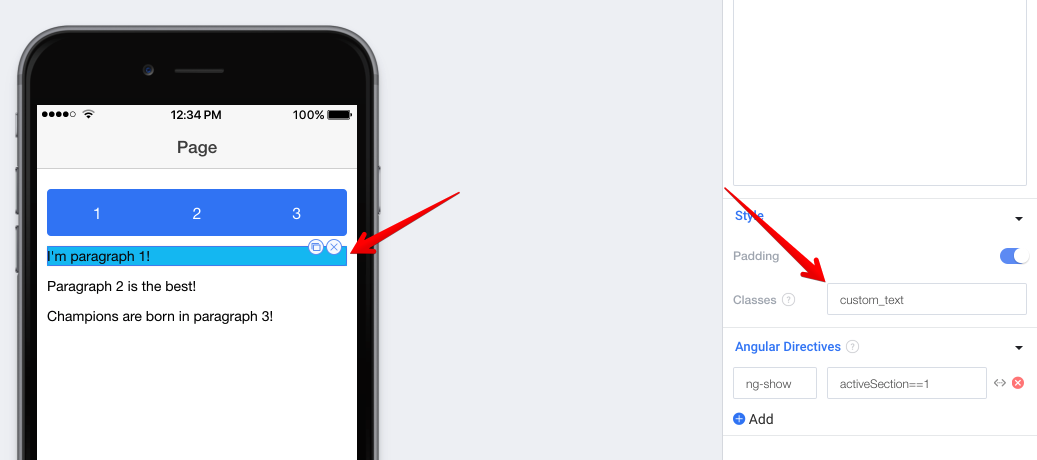
After specifying a class in the SCSS editor, you can add it to any element using the Class property.
Another tutorial I highly recommend watching if you're looking to learn more about custom styles is our Beautiful Side Menus weekly workshop.
Updated less than a minute ago
