Slider
The Slider Component will let you add background images & components to individual slides that the user can swipe between.

Feel free to read more about Sliders below, or give this video a watch where we show you how to use them:
How to Edit your Slides
The Slider parent component can have multiple "Slide" components as children. Each Slide has its own properties and can have its own children components that you drag in.
Only 1 Slide can be edited at a time
Slides will automatically become the editable slide if you select them in the left sidebar.
You can also use the dropdown in the properties pane of your Slider or another Slide to switch the active editable slide.
Adding Components to your Slide
Each Slide is it's own Drag & Drop container. You can drag components into the currently editable slide like you would drag them anywhere else (see the note above).
Adding a New Slide
Select your "Slider" component in the left sidebar and then click on the "Add a Slide" button in the properties pane.
Previewing your Slider
When in the Editor, you can't actually use your Slider. You must enter preview mode to interact with your Slides.
Slider (Parent) Properties

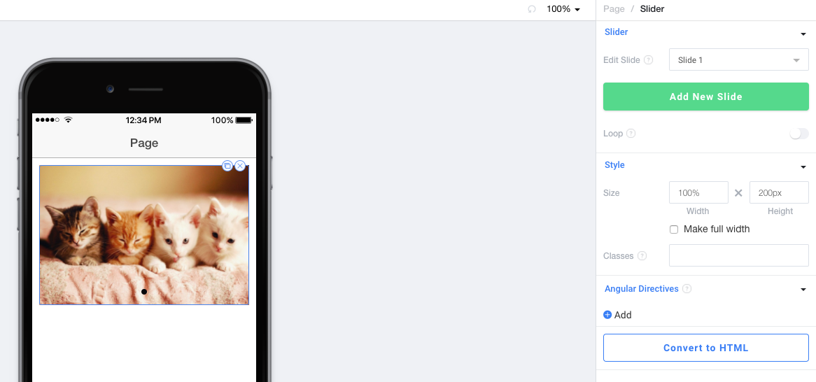
Slider
Edit Slide allows you to change which slide is currently shown and editable in the Editor window.
Add New Slide will add an additional slide to this slider and automatically select it.
Loop sets whether or not a user can swipe to the first slide from the last slide in an infinite loop.
Style
Size sets the width and height of the Slider. Make full width will make the Slider go all the way to the edges of the screen even if the parent page has padding.
100% Height and Page Scroll
If you set height to 100%, we will automatically turn off Scroll on the parent page. Sliders cannot be 100% height with a scrollable parent.
Classes lets you freeform add CSS classes that will be placed on this component.
Angular Directives
Angular Directives lets you add Directives to the component.
Convert to HTML
Convert to HTML let's you turn this component into an HTML component so you can edit it to your hearts content.
Individual Slide Properties

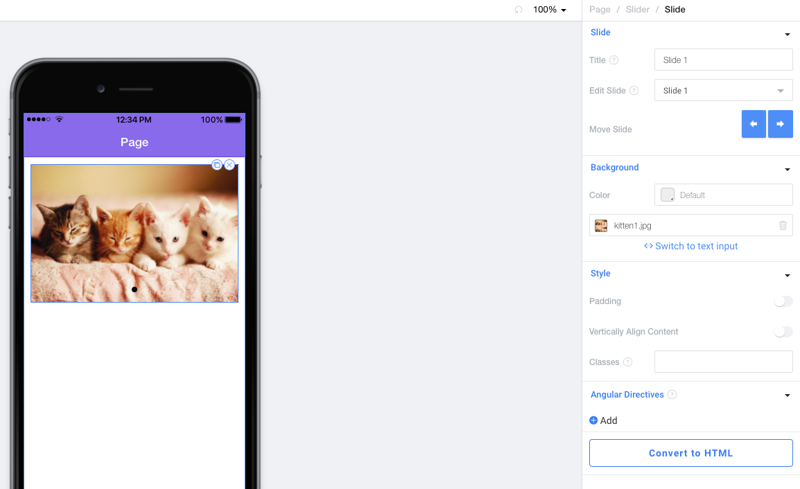
Slide
Title sets the title that we show in the Edit Slide dropdown and in your Project tree. It has no effect on the output of your code.
Edit Slide allows you to change which slide is currently shown and editable in the Editor window.
Move Slide allows you to move this individual Slide left and right in the Slider. You can see the position of this slide in the Project tree.
Background
Color sets the background color of this slide from a color picker or HEX value.
Background Image allows you to set a background image for this slide.
Remove the kitten picture from default Slides
Your default slides will have a background image of a kitten. Just click on the trash icon in the Background section to remove this background image.
Style
Padding sets whether or not this slide should have padding around it.
Vertically Align Content will center the components you drag into this Slide vertically.
Classes lets you freeform add CSS classes that will be placed on this component.
Angular Directives
Angular Directives lets you add Directives to the component.
Convert to HTML
Convert to HTML let's you turn this component into an HTML component so you can edit it to your hearts content.
Updated about 5 years ago
