Cards
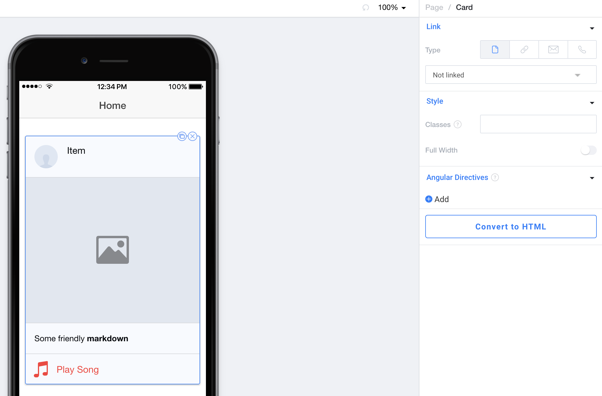
A Card is a special kind of List that is inset and has a drop-shadow around it. Any List Component can be included inside of a Card.
By default we include an Avatar List Item, Image, List Item Container with Paragraph inside of it, and an Icon List Item just to show you what's possible.

Link
Link allows you to navigate to a different page or add a special link to this entire Card. Please see our Navigation & Special Links documentation for more information.
Style
Classes lets you freeform add CSS classes that will be placed on this component.
Full Width when toggled will make the Card extend to the edges of the screen even if the page has padding.
Angular Directives
Angular Directives lets you add Directives to the component.
Convert to HTML
Convert to HTML let's you turn this component into an HTML component so you can edit it to your hearts content.
Updated less than a minute ago
